pondělí 30. listopadu 2015

Konvertibly, hybridy, tabletonotebooky a 2v1: který z nich je právě pro mě ten pravý?

Snadno přenosné počítače, které se lusknutím prstů promění z nekompromisních produktivních strojů na zdroj nekonečné zábavy, jejímuž přívalu nebrání umělá bariéra v podobě klávesnice, nejsou nic až tak nového. Již v éře Windows XP můžeme spatřit první seriózní pokusy. Tehdejší zařízení však byla příliš těžká, drahá a nedisponovala dostatečně dlouhou výdrží baterie, aby se mohla široce rozšířit. Navíc krom standardního notebookového ovládání podporovala kvůli nedokonalé rezistivní dotykové vrstvě na obrazovce jen stylus – na ovládání prstem jste mohli zapomenout.


Jak by mohl konvertibilní počítač vypadat v budoucnosti?

úterý 28. července 2015

Windows 10: Did It Learn from Windows 8?

There is no doubt that Windows 8 will be liken to Windows Vista as one of the biggest flops in Microsoft's modern history. When it launched three years ago, bold goal was set - despite late entry to competition, to make Windows a respectable player on the tablet market. Dominant position in the world of desktop computers and notebooks was hopeful promise to join well-established old hands, Apple with its iOS and Google's Android operating system. Unfortunately, even humble expectations were far from fulfilled. Not only Windows 8 failed in tablet area. It also did not turn away rapidly declining PC sales.


I will cover Windows 10 for x86 devices like convertibles, AiO, ...


Microsoft didn't commercially succeed with its touch smartphone platform Windows Phone too, but they got highly positive reception from customers and tech-press, who praised surprisingly original user interface (UI) and blazing fast operation even on low-end devices.


  ▌  1) Upgrade Experience
  ▌
  ▌  2) Core User Interface of the Operating System
  ▌
  ▌  3) Windows Universal Platform
  ▌
  ▌  4) Not Perfect Yet
  ▌
  ▌  5) Conclusion


Windows 8 could hardly be criticized for slowness. But user experience was completely different story. Experimental fusion of desktop with tablet UI resulted in an epic fail, highlighted by firing  Steven Sinofski, President of Windows Division, just few weeks after launch.

Version 9 was skipped to make us forget about recent painful experiences easier. Launch of Windows 10, developed under supervision of ex-head of Zune and Windows Phone departments, Joe Belfiore, is imminent. Although general availability date was set to tomorrow, 29th July 2015, RTM build is already available for 2 weeks to Windows Insiders. I happen to be one of them and covered Windows 8 extensively from the beginning, so... let's see whether people at Redmond learned from their previous mistakes.


Through Windows Insider, Microsoft finally listen to consumers

To make things clear beforehand: this is not a complex review of Windows 10, nor whole Windows 10 product range. I will focus on Windows 10 for x86 devices from consumer's perspective. I will investigate which my subjective shortcomings were (not) addressed.

Upgrade Experience

Installation and out-of-the-box experience may vary, depending on the way you initiated the installation, version of installation files or who manufactured your new computing device.

I made an update from older Windows 10 build via Windows Update. Although ISO file for 64bit Pro Insider Preview versions had around 3 GB, decompressed update files may take even double in size.


Simple and clean, yet not informative installation screen

Three chapter names, progress indicators - that's all, absolutely no useful info. To assist approx. 30 minute installation would be a complete waste of time, if the installer wouldn't automatically restart my machine three times. No warnings or countdowns each time, just a general "we'll do it sometimes". Really annoying for those of us who use dual-boot.

In case you have proper sync data saved in cloud, settings from your previous Windows device may be downloaded by signing in with Microsoft Account. Do not expect transfer of Start customizations and pinned links of Store apps you own this time - these features introduced in Windows 8 were removed.

If you don't have Microsoft Account and decide not to create one, there is an option to make local account instead. When signing in like that for the first time, along with oblique Microsoft Paint or Calculator, all you'll get is just Recycle Bin on an empty desktop and web browser pinned to Start. No links for other Store apps, nor Windows Store itself. Sick of bloatware? You would be happy. Nonetheless, it appeared like a glitch later, because when I signed-in with Microsoft Account first and created a local account then (it took me some time to figure it out - Microsoft obviously want you to avoid local accounts), Store was present, along with two groups of app links in Start. That's also what I got with Microsoft Account without any sync data.


This is what you get when you launch Windows 10 for 1st time

My device was correctly detected as a desktop, so the first regular start led to desktop environment. (Download Windows 10 official "Hero" wallpaper in maximum quality from here.)

Core User Interface of the Operating System

Apart from poor app selection and quality, the stumbling block of Windows 8 rested in it's deep-rooted duality. People had difficulties to move across system and keep it under control. Although they adopted all those unusual gestures and became reconciled to distinctive "Metro" look, something very important was still missing - intuitive operation, elementary logics and enjoyable user experience.

Instead of one unified environment, they got two. The first was backward compatible desktop one, which had unlimited set of features thanks to millions of already existing programs. It allowed users to manage almost entire world with a tablet from bathtub, which is something very different from feature-limited established tablet platforms. But operation with hand was very uncomfortable due to almost non-existing touch optimization. The second was entirely different tablet one, which didn't fit mouse and keyboard devices very well and lacked features. Disaster was successfully accomplished when these two were interconnected in such a non-sense manner that it seemed like it was a result of pure randomness.


Windows 8: ergonomic disaster of epic proportions

The concept was bad at its core - Microsoft assumed users will use mainly desktop programs in desktop environment, then transform their device to tablet and use mainly touch apps. With full-screen Start in addition, there was complete lack of continuation.

Thanks God this is over!

As far as I'm concerned, Windows 10 is coming with best solution possible in this area. Although I could feel offended and jealous that Seattle-based software giant adopted a concept of Jay Machalani rather than mine, all I have to say is just... bravo! Instead of a fusion of two operating systems with two task switchers, we got only one this time. Inevitable duality lays somewhere else now - there are two ways of manipulating running applications (no matter whether we talk about old Win32/.NET "programs" or new WinRT/Store "apps").


Desktop with familiar Start button, windows and Taskbar

Everybody knows how a desktop work. It already excelled thanks to decades of polishing. With introduction of virtual desktops and ability to snap windows to corners of the screen, it is almost perfect now.

It is great that you don't need 3rd party utilities to run modern apps in windows anymore. Even small Start menu, this time in sort a hybrid appearance, is back. No more just full-screen!

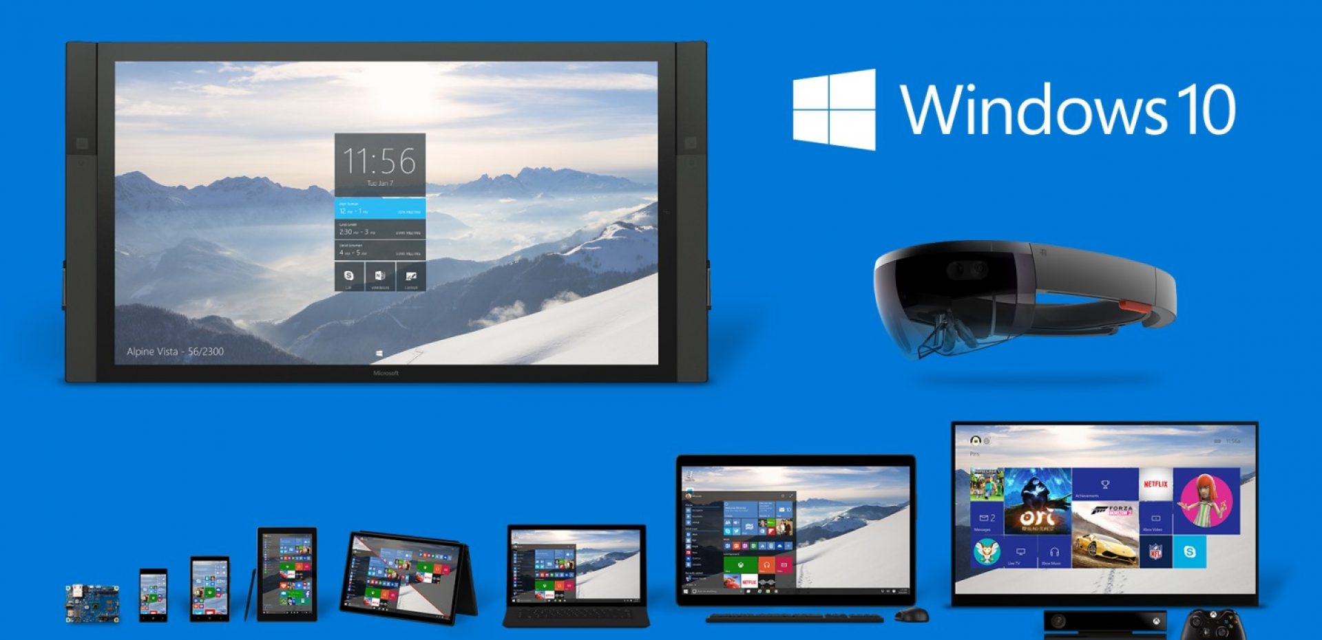
With virtual desktops and ability to snap windows
to corners, desktop is almost perfect now.

Nothing significant changed for worse here, even if you come from Windows 7. Some mutual aspects like volume control or calendar were slightly adjusted for touch.

When you click a system button called "Tablet", layout gets very similar look, but different rules are applied. All windows turn into touch-ready full-screen (or rather full-height to be absolutely exact if we consider snapping) panels known from Windows 8 "tablet part". Start goes full-screen too.

You just get a different approach to same content.


Setting up Tablet mode: it can switch automatically there and back

Guess what? There is finally a continuity! That's probably why they call this cool feature "Continuum". Activating tablet mode manually isn't required if you have proper device.

The general concept got radically changed. There still remain power-user programs like full-fledged Office. But in case you engage casual activities, like browsing a web, there is an assumption you'll use identical app both on desktop and tablet. In other words, no more two separated Internet Explorers. You practically won't get even one, because Internet Explorer is hidden in the system and it's successor Microsoft Edge, formerly known as "Project Spartan", have become a primary browser.

No matter whether using mouse or touch, you can enjoy features like Cortana or Action Center taken over from Windows Phone 8.1 or brand new ones like SnapAssist - all of these were made with all users in mind.


Snap Assist in action - it works great both with touch and mouse

One wouldn't believe how many issues got automatically fixed when Hot Corners and Charms Bar were thrown away. The first is completely inessential and all Charms Bar features (except Share contract - I will go back to this topic later) were moved to apps itself, which makes sense.

Windows Universal Platform

New approach wouldn't work if other parts remained the same. That's why Microsoft comes with so called Universal Windows Platform aka UWP. It is an evolution of WinRT known since Windows 8: both mouse and touch are supported again, both x86 and ARM are supported as well and apps may be obtained via Windows Store. But tons of great changes were made in this area.

UWP takes interplay between devices within
the ecosystem to whole new dimension.

In the past, if you wanted the same app on a tablet, as well as on a phone, you had to get two different separately. They could look the same, they could come from the same developer, but they were different inside. By sharing user data and having one single app that flex across all form factors, from compact phone to Surface Hub, UWP takes concept of interplay between companion devices within the same ecosystem to whole new dimension. What changes when switching devices is not a binary, nor data. It is literally identical everywhere. What changes is layout and the way an app interacts with user. And when done properly, it works really great!


Redesigned Windows Store - one place for phone and tablet apps

Demand for flexibility finally push developers to accent widely scalable responsive design. How to achieve user comfort and maintain orientation? The magic lays in clever, yet simple design guidelines. Various techniques exist, like designing apps to vertical frames, but so called SplitView is much better example. What's that? It's very similar to responsive web design we know for years. There is always a content displayed, only formatting slightly varies. And then, there is navigation, which adapts in a more complex way. Are you sitting in front of large computer screen? Fine, let's unveil navigation menu in it's full glory, consisting of icons and labels. Is there a temptation in your mind to alleviate fatigue by laying down to bed with a tablet? Fine, let's hide labels and unveil them on demand. Is there an emergency to quickly go somewhere with a phone? No problem, navigation menu made of icons and labels will temporarily overlay the content when you tap hamburger icon and will go away after you make a selection. Brilliant!

To scale user interface consistently, Microsoft introduces new measuring unit. Thanks to Effective Pixels, which brings viewing distance, device type, screen size, resolution and DPI in account, there is a great chance an app will appear to be of same size, no matter what device is used. EP goes hand in hand with merging or enhancing simple apps. No more primitive Calculator blown-up on a TV! The app fused with Unit Converter and got supplemented with useful history.


To understand EP better, click + symbol to play video

The look is one part. Controls is another. How to make apps work great both with touch and mouse, both in windowed and tablet modes? Controls became less thumb-centric. And horizontal panels at the bottom of the screen were completely scrapped. Interaction moved to the app itself. Among others, by bringing context menus back. And thanks to input detection, items are shrank when evoked by a mouse, and higher offset is applied when evoked by a touch.

Not Perfect Yet

I highly appreciate the progress, but some things need improvements. Windows 10 isn't the worst case of rushed launch, but although (or because?) I took latest updates in account, I have to say that hurrying up with upgrade may not fully pay out.

Internal communication and coordination
is a big issue inside Microsoft.

Overall inconsistency remains one of the most serious sins even in Windows 10. Not all past problems were solved and new problems emerged. When you encounter some of such non-uniformities, it makes an impression that internal communication and coordination is a big issue inside Microsoft.


New improved Settings next to old degraded Control panel

Regarding unpaid debts, no single place to perform all settings is available. Not only there is still Control panel along with modern Settings, while none of these are self-contained. Lots of common settings were completely removed from Control panels, like customization options or Windows Update. In case you use tablet, fine, most (if not all) things may be found in Settings. But on desktop, you have to use both in order to set everything, which sucks hard.

Although I understand that every app requires slightly different treatment, it is unacceptable that some behave completely different when performing same actions. Do you recall SplitView I mentioned before? Some apps allow to dock full size menu by clicking an empty space on a collapsed panel (Mail). Some reacts only when you click hamburger menu at the top (Groove Music). And there are apps that do not allow to dock full size menu at all, no matter what you do – icon labels work only in overlay mode (Insider Hub).

If you want to send feedback to developers, sometimes there are „smiley“ icons in the middle of a menu panel (Money). Sometimes, the same icon is at bottom (Mail). This icon sometimes leads to Windows Feedback app (Mail). But sometimes, there is in-app form (Edge) instead. Elsewhere, you must go to Settings. While in Photos, there is a „Send feedback“ button at bottom, in Groove Music, there is a „Feedback“ link on the right. Get Started section is probably flawless - there is no way how to submit an objection at all.


Ability to send feedback is not unified across various apps

When you seek a now-playing track in Groove Music, there is a pop-up tip tool showing current time. When you seek a clip in News, all you'll get is just a „Seek“ tooltip. And finally, when you seek a movie in Movies & TV, you'll get nothing.

While some apps have great keyboard shortcut support (Mail), others lack the most basic shortcuts imaginable. F11 to go full-screen in Edge? Ctrl+F or Alt+Enter to watch movie full-screen? Ctrl+A to select all items? Not in stock at the moment, sorry. Innocent rodents were not spared either. Going through 3D cities in Maps is almost impossible with mouse. Back and forward buttons don't work reliably. Pivot items have no scrolling wheel support.

Backlogs? Oh yeah, we've got them too!

There are moments when you feel like Windows 8 strikes back. In login screen, you get Windows 8 network dialog, while the same dialog evoked from Taskbar has appropriate Windows 10 style. Playing music in the background and using multimedia keys on keyboard makes Windows 8 multimedia symbols appear in top left corner. When you make a right click in Cortana text bar, you will get Windows 8 style context menu. It’s 8th addition to already rich collection. Rather don't try build-in Sharing contracts - it looks exactly the same as in Windows 8, both in terms of style and size (yes, full-screen).


Taskbar customizations are rich, yet imcomplete

Backlogs? Oh yeah, we've got them too! Touch-first Skype is not ready yet, as is ability to snap more than 2 apps in Tablet mode. Drag and drop in universal apps doesn't work, although it was announced few months back at BUILD conference. Nor managing files comfortably on a tablet is happening. Though far from perfect, could we at least get a simple touch mode in old File Explorer like we know it from Office 2013?

Regular bugs are also present, both in system and apps. Guessing from how individual builds improved over time, few more months would be needed to fix them all. The best thing to do first in Windows 10 is to launch Windows Update and check whether more current versions of apps are available at Windows Store. 

Following issues are more of a subjective character and depend on individual taste, but I will mention them nevertheless.

I’m not very happy having Taskbar in Tablet mode. Single necessary feature there is a back button. And since there are no mandatory back buttons inside apps, nor on devices, you simply can't hide it without negative practical consequences. What more, there is no way to make Taskbar invisible only in Tablet mode. Will it settle? Maybe.


Unlike Windows 8, Windows 10 Tablet mode contains Taskbar

Transforming Start to Cortana and having two Cortanas when using Edge, one in the lower left corner and other in top right corner, seems quite confusing to me. I can deal with it, but what about average Joes?

I will miss swipe-from-left-edge gesture to switch last-used apps and aesthetic panorama controls introduced in Windows Phone 7. These were sacrificed in favor of universality and practicality.

Conclusion

So, did Windows 10 learn from Windows 8 after all? For the most part, yes! And thanks to declared dedication of Microsoft to pro-actively improve the system and build-in apps (no reason to be skeptical - we got 30+ updates in just two weeks), listening to user feedback and incoming Windows 10 Mobile, things will for sure get better.


Multitasking on a tablet as a competitive advantage? Not anymore

One question was answered. Other questions appeared. Will Windows 10 keep up with iOS and Android in terms of apps? Will people overcome Windows 8 disappointment? And are there (still) enough arguments to switch?