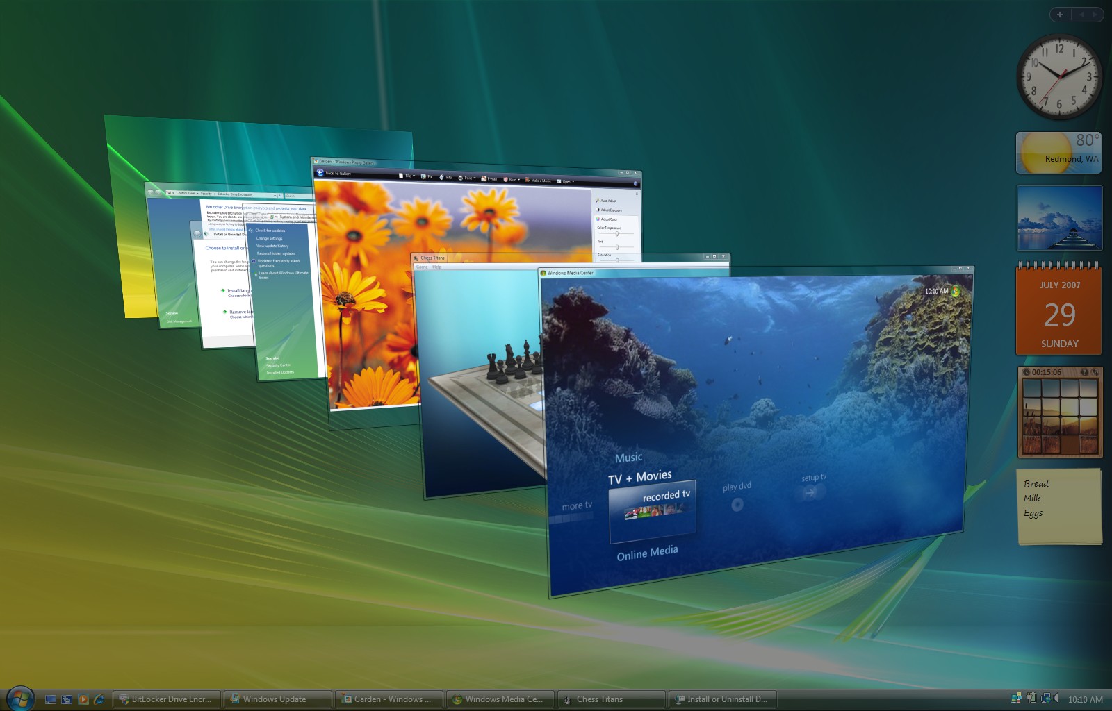
Even more than 15 months, one major and dozens of partial updates later,
Windows 8 still pretty suck. Originally, I tried to keep a hope that the most criticized features of latest Microsoft operating system will be tuned in a few months by cleverly aimed polishes, but as time passed by, my presumption turned out naive. Although we got improvements like
encyclopedic search results or
hands-free mode, the most acute downs of the OS -
confusing duality of desktop and modern environment,
lack of consistency (continuation) in visual navigation and
poor app quality - remained unchanged. There still exists a chance to shift things forward, but Microsoft obviously
has no clear strategy in mind at the moment. As such, various people share their own ideas on how to put the shattered glass together. I was
patiently looking for and reporting bugs and bringing suggestions. After I got to know thorough project
Fixing Windows 8 by
Jay Machalani, I found myself not being active enough, so rather than focusing on particular details, I got inspired and designed a complex solution.
Supplemental demo videos include highlights of the concept

Jay made tremendous job. His tweaks would definitely make Windows 8 more logical and easier to use. I especially identify myself with Windows Lite (Modern UI only OS) and Windows Pro (adding classic app compatibility) concept. I got to like
notifications implementation next to charms bar too.
▌ 1) Essential Requirement: Make Modern UI Grow Up
▌
▌ 2) User Interface Structure Changes
▌
▌ 3) Introducing Modern Taskbar
▌
▌ 4) The Power of Choice
▌
▌ 5) Conclusion & (Anticipated)FAQ
Nonetheless, my own design addresses defects mentioned above more radically. I’m not claiming this is the ultimate solution. Percept it just as an alternative to other concepts out there. Unlike Jay, who tried to solve the coexistence of modern and classic apps by separating the two worlds resolutely, I went the other way - by bringing them together.
Caution 1: In order to understand my presentation, there's a need to have an idea how
current version of Windows 8 work (I used version 8.1 build 9600 - latest officially available stable build - as reference). At the same time, there is a need to free yourself from deep-rooted habits from previous versions.
Caution 2: Unlike Phyek or Eiskis, I didn't intend to amaze audience with reworked and refined graphics (aside a fact I would be unable to beat such a higly skilled guys :-)). I tried to use current assets and reorganize them in my way. My primary focus was usability. I respected some things Windows 8 came with and haven't changed them at all.

A brief static showcase of my design concept
Caution 3: In order to make things work perfectly and
consistently, I would need functional prototype and put it through
extensive collective testing to get the most varied feedback. I can't
afford that. What follows is a maximum I was able to reach with my limited resources. Tests could find out that some suggestions aren't usable in any way.
Essential Requirement: Make Modern UI Grow Up
If I did not clarify certain subject beforehand, most desktop users (and probably not just them) would immediately refuse my ideas. It wouldn't surprise me. What am I talking about? Despite incredibly robust design guidelines which counts with touch and non-touch devices of all sizes (Microsoft didn't mess around last years in the end!), quality of actual state of modern environment, which will be sole subject in this chapter, is incredibly low today (or did they?). It simply fails everytime.
When a finger is used to control tiny 7" tablet with ancient 1366x768 resolution, aside from details like difficulty to recognize interactive elements, things may
seem fine at first sight. The screen is effectively used for content and interactive elements. Items in tables are arranged as they should. The problem is that Moden UI is far from being stand-alone and self-sufficient. For example, you can't set up speakers there at all (except volume), so you remain dependent on mouse-first Desktop a lot. When a finger is moved to 30" Full HD (not to mention already
available 4k) display, serious issues start to pop up. The screen gets half empty, sometimes because the app is exceptionally primitive in functions, sometimes because
it is not optimized for higher than HD Ready screens. Unfortunately, it doesn't end with esthetics. Various items disarrange too, so proper reading of content is impossible. Depending on settings, entire UI may be blown up, but one get to feel like
half-blind old man. High resolution screen you paid extra money for is wasted too. The better the device, the worse the experience?!

This half-empty screen shows up in Store app
Damn, even the most complicated websites are able to adapt itself from 3" mobile phone in hand to
40" TV in a living room! (Zoom Smashing Magazine site in and out, open it on various devices, change the orientation of your device or resize the window of your browser.)
"Built-in scaling means your app and content always look great, whether
on a small 7" device or on a big 30" monitor. You just need to use a
fluid layout and make sure the graphics in your app look good when
scaled."
Windows Modern UI Design Guide
Dare
you to use mouse or keyboard! Scrolling performed by wheel rotating does not always work well. Scrolling by pressing wheel and changing cursor position somewhere works (an app), somewhere does not (PC Settings). Back
and forward buttons don't work on certain places too. From time to time, apps fight with each other and focus (that rectangle moving across interactive elements when Tab is pressed) is absent.
"When you design app for touch interactions, you get support for
pen, mouse, and keyboard interactions for free. Your users can switch
from one input method to another and not miss a beat of the app
experience. Plug a keyboard into a tablet? No problem. Your app responds
consistently and predictably to your users' choices."
Windows Modern UI Design Guide
How on Earth can Microsoft demand strict requirements compliance toward third party developers if even them don't follow their own rules?

That's how Settings should adapt to larger screens
Redmond, implement widely scalable responsive user interface at all costs.
Build in full mouse and keyboard support. Pervasive shortcuts and gestures would be nice too.
Don't remove useful novel features like a coward. I miss the old full screen search.
Provide interactivity between apps. To copy files from Explorer to SkyDrive app (Microsoft haven't renamed it to OneDrive yet in Windows 8) or drag text to modern app is not possible today.
Allow developers to set default size of any app and forbid to resize it. Half-empty screens or absurdly blown up graphics will be prevented.
Give the apps better help system. Implement pop-up help into every individual button, without single exception.
Force Adobe, AutoDesk and other high-profiled software developers to make modern apps. Give us power-user apps like Office. Add features to the existing ones. Mirror build-in tools like Task Manager, Control Panel, File
Manager and so on to Modern UI. It will have to be done now or later, so what are you waiting for?

Glimpse of how help system in Modern UI could improve
Make
Modern UI undergo memory exercise (I'm not talking about RAM,
although apps could load faster). When you make a search, select
some search result by mistake and then recall search bar back, you have to
input keywords again to repeat the same search. Such a detail, such annoyance! Apps could also remember it's last state
regarding position and size. Was the app closed snapped? Open it
snapped. And vice versa.
When you go to installed apps list (under Start Screen), tt's difficult to orient. Arrange the apps by an alphabet - every letter should have it's own column or row.
God bless you for allowing to pin modern apps to Taskbar in Update 1.
Allow Start Screen to get snapped. Collectively open apps feature is a
must. Close gesture on Start Screen could offer shut down options. There is huge room for improvements.
And for Christ sake - stop saying "Welcome" until the correct password is entered into the log screen. The fact that the same idiocy was present in (over)popular Windows 7 doesn't justify that.

To launch more apps at one time - wouldn't that be great?
My humble and honest advice is: focus the whole future development on Modern UI. It desperately
needs to grow up in every possible way. If it already was the case,
nobody would have to rely on legacy apps with its DPI issues and problematic touch support. At the same time, nobody would force you to use the modern ones. You should get a choice, which is not the case now. Do
you plan to develop two environments/versions of apps forever?
User Interface Structure Changes
Now that we've got perfected, standalone and desktop-ready Modern UI, my key goal you maybe already saw through can finally be unveiled. My intention was
to design improved, entirely Modern UI operating system supplemented with classic apps
backward compatibility while keeping all preinstalled classic apps and tools like Device Manager and bringing windows transparency back (how can removing this feature from Windows 8 save hardware resources when Taskbar shines through and effects haven't changed?). Plain logic below served as the ultimate guide to me
during the creative process:
Modern UI may be easily controlled by mouse, while classic UI can't be easily controlled by a finger.
Not only desktop users won't lose a single feature - they'll even benefit from these changes!

Proposed structure of the UI - enlarge for comparison
Are two app launchers really necessary? We call it Start Screen here and
Desktop here, but it works almost the same way: we can add, remove or
group the shortcuts; we can place wallpaper there; we can go there in an instant. Let's keep just Start Screen! Regarding it's missing features, renaming and no restrictions about shortcut targets, free icon positioning or basic file management could be taken over from Desktop. Context menu is highly appreciated, although its classic style doesn't fit there.
Why
do we need two separated areas for opened apps? The first is called Desktop again and we move windows across it. The second one is called emptiness, blankness or darkness I guess, shows up when we snap an app and redirects us to Start Screen when we touch or click it. Leave just one and name it a workplace! When window would be manipulated, different rules will be applied (place the window to edge and resize it to half of the screen, perform Aero Shake to minimize background apps) in comparison with manipulating a modern app (snap and close gestures). People will get more freedom, because overlay across modern and classic apps will be, thanks to erasing virtual boundaries among them, possible. New "Fill" feature would utilize free screen space to resize a classic app if there is a snapped modern app and subtle change of Maximize function meaning would allow to use entire screen space.

Lets kill some redundant features - click for uncropped picture
What are two taskbars good for?
We have the desktop one and the Modern UI one (call it switcher if you wish; paradoxically classic UI context menu appears there now). One contains the other, the other does not. What a chaos! What about combining them to one and manage all opened or pinned classic and modern apps in one place? Yes, this is what I call a solution!
Introducing Modern Taskbar
If a single highlight of the whole project should be picked, I would probably choose Modern Taskbar, which makes most of changes possible without sacrificing user control. In fact, it represents key signs of the concept: bringing simplicity into place, taking the best of Desktop to Modern UI and reducing doubling structural UI elements to one unit while improving experience for both touch and mouse users.
Some may refuse it immediately, but believe me, it is just matter of habit: new Modern Taskbar would sit on the left edge of the screen and couldn't relocate. Due to already mentioned duplicities and various customization combinations, it was easy to find situations Microsoft didn't count with. There are three more reasons for this decision. Upper edge of the screen is reserved for modern app close gesture. Right edge provides access to Charms Bar. Finally, lower edge is dedicated to modern apps context menus. Since our displays are rectangular, there is no other option. :-)

Full-sized Modern Taskbar in action, snap in background
Modern Taskbar would operate in two modes. Partially customizable full-sized (or full-scale) Modern Taskbar visually reminds modern app taskbar/switcher from Windows 8. Similarities? It contains modern app live previews with possibility to show their context (this time in modern style, i.e. touch-ready) menus, may be displayed by mouse ("L" shaped) "Hot Corner" gesture or by a finger (swipe from left edge and back), disappears automatically when other app stands in foreground and has Start button (securely attached!) at the bottom. More importantly, full-sized Modern Taskbar newly picks over responsibility of the old, already non-existent desktop Taskbar like managing classic and pinned apps (modern ones too), ability to change order of icons and spatially efficient time indication (I'm especially proud of! :-)) along with configurable basic notifications (B stands for battery, R for RAM in my concept).
It also contains it's own Modern UI style context menu with configurable shortcuts for your favorite apps or
places with function to collectively manage opened apps. Regarding context menus, it's good to point out that there are no classic context menus outside of classic apps and that modern apps context menus sliding from bottom of the screen would be, as already mentioned, preserved.
How to distinguish pinned and running apps? Pinned ones are greyed out and have large app icons. How to distinguish classic and modern apps? The same way as in Start Screen - there is either classic style icon (colored 3D) or modern style icon (white 2D).

Context menu of docked compact Modern Taskbar
In
addition, you can resize icons á la Start Screen and give them "Skip" attribute. What does that mean? When "Skip" option is checked, the app will be skipped when you switch apps by keyboard (Alt+Tab) or touch gesture (slide from left edge), which allows to display indication of services with GUI without obstructions on the same place (these were previously placed in notification area in classic Taskbar). This leads me to another novelty - now that Windows Flip 3D is gone (at least something was done for consistency, although it was the best UI innovation of Windows Vista), we don't need dedicated app switcher
anymore, because full-sized Taskbar will replace it sufficiently.
You can also set Modern Taskbar to docked compact, but uncustomizable state, which will offset apps adequately to the right. Docked compact Taskbar remains always visible (unless full screen classic app is launched), even when you go to Start Screen. Thanks to its compact size, it does not interfere with workplace dramatically. Especially desktop users - I'm one of them - would like it for sure.
In case you want to dock or undock modern compact Taskbar, you simply enlarge it to full-size and click on |> or <| symbol next to Start button. Regarding conservative users ("It's not my good old Windows anymore!"), it behoves to mention that enlarging or autohiding taskbar is nothing new for Windows, but most people don't use or know these features at all.

Full-sized Modern Taskbar allows to resize icons of apps
When apps are switched via Alt+Tab, full-sized Taskbar will replace the docked one temporarily (if it's not displayed yet). It will hide again right after fingers are put out of the keys (or touch any other area when using a finger to call out the Taskbar). In case you wish to temporarily display the full-sized Taskbar without switching the apps, touch or mouse gestures are still available in this mode. When you move mouse cursor over Taskbar in ordinary way, docked compact Taskbar will remain shrinked.
I considered docking the full-sized taskbar in the past, but rejected it.
The Power of Choice
Since some things can't be identical for both touch and mouse users, they should have right to decide themselves.
When installing Windows 9 on a computer equipped with both touch screen and pointing device (typically all-in-one PCs), there would be discreet, although highly important dialog. It asks whether you put
mouse or touch on first place. There are four choices regarding default settings of the operating system.

Installation process should contain detailed help
Do you want to have Modern Taskbar docked or undocked when the OS boots for the first time?
Do you wish to associate various filetypes to desktop or modern preinstalled apps?
Which shortcuts do you prefer on Start Screen and in taskbar context menu: those leading to
desktop or
modern apps?
Two presets would be offered, "Modern environment" and "Classic-friendly environment". If you're not O.K. with any of them, own selection of sub-options can be made.
Non-mouse devices like tablets
would be automatically set to "Modern environment" and non-touch devices would be automatically set to
"Classic-friendly environment". In these both
cases, this dialog would not show up at all.

Do you prefer modern or classic-friendly environment?
Other improvement of installation procedure would lay in sequence of actions. How many times have you presumably begun prolonged installation process, left computer working without your presence and than came back to find out that there was a need to fill in desired future account name just before the installation begun? That would be over now, because installation steps are strictly arranged in order to collect your
inputs first. The lengthy installation itself, consisting of decompressing gigabytes of data, would occur as a final step later without any
need of user activity.
Conclusion & (A)FAQ ([Anticipated] Frequently Asked Questions)
More changes would mean to run into extreme details. Even when the rest of Windows 8 leaves untouched (although imperfect), it would serve much better than now in my opinion.
Any suggestions or opinions are highly welcomed! If you like my design concept, spread the word. If you don't like it, please share your opinions. I'm open to any kind of feedback.

Where are the days of GUI consistent Windows XP?
Let's hope that one day, Windows will get it's sign attributes back: simplicity, soberness, continuity and logics. And it doesn't matter whether thanks to mine, yours or anybody else's influence.
You want to make desktop users live in modern environment. Are you kidding me?
No, I'm not kidding you. Although I tried to optimize modern environment for mouse and keyboard in the concept as much as possible, I understand nothing fits all. When you use mouse, nobody at least force you to use modern apps. When working in classic apps, Modern UI won't distract you in any way. Classic and modern environments share similar design principles. Although context menus in modern environment leads to modern setting screens (though this could also be configurable) and key UI elements of the system are designed in modern style, all functions can also be changed by accessing Control Panel or another classic tools. As already mentioned, all classic build-in apps and tools would be preserved.
Full-sized Modern Taskbar in action, snap in background
I'm tired of these Windows 8 haters who saw it from far distance in store. When will you stop whining?
I've spent months using Windows 8 since Windows 8 Developer Preview back in 2011 to Windows 8.1. I'll stop when Microsoft's more than thirty years of experience in making software comes under the Sun again.
Why does Windows 8 mean so much for you?
I appreciate the brave act Microsoft did, but the result highly disappoints . There is no other operating system like that: combining mouse with touch and preserving backward compatibility.
Where can I download those wallpapers used in your concept from?
The landscape used as a wallpaper for workplace may be downloaded from these places. The wooden wall used for lock screen may be downloaded from these.
 Lock screen uses similar-style time indication like Modern Taskbar
I want to use modern apps, but I'm tired of travelling with my mouse cursor from one end of the screen to another. What am I suppose to do?
Aside from fact that users of Apple's famous Mac OS X have to travel over entire screen for context menus too, you can perform many Modern UI actions via keyboard. For example, instead of performing mouse gesture "slide from top", you can close modern apps with Alt+F4 key combination. Changing sensitivity of your mouse could solve the issue too.
Aren't you ashamed of ripping Unity off and present it as your idea?
Windows 8 already have a taskbar/app switcher on the left. There are even more reasons of me having Taskbar there. I've seen Linux only from a far distance and never used it.
Allowing to snap the Start Screen breaks the philosophy of Start Screen being a headquarters of the system.
Start Screen becomes another ordinary build-in tool like Search or PC Settings in my concept. It is just a launcher. The centre of my concept is Modern Taskbar. Instead of a temple, you get an altar. :-) This is not a question by the way. :-)
 27" Dell S2740L - the display used in video of design concept
Where did you buy that touch Dell display used in showcase videos?
Due to limited resources, I had to fake the touches. :-) The display is a standard 27" Dell S2740L without any touch layer. Only buttons to set-up the display are equipped by touch sensors.
How can you demand responsive design when your blog is optimized for 1024x768?
Nobody force you to open my blog in full screen. :-) I believe the layout of my blog fits its purpose. It's not some kind of complex e-shop, but rather personal diary. And I'm not a professional.
How long did you work on this project?
Longer than expected. :-)
7th July 2016 update: Now that Windows 10 with different UI structure got well established, don't you regret investing time to your Windows 9 concept?
Although I acknowledge that changes made from Windows 8 to Windows 10 were well decided and I consider Windows 10 better than my concept, mainly thanks to Universal Windows Platform initiative, something has to be said. What I tried to do in my concept was to keep lots of great things from Windows 8 alive. I tried to introduce subtle changes to make two years of work by Microsoft worth. With Windows 10, Microsoft decided to throw most of things from Windows 8 away and start from scratch. I believe it was a great decision, but it did not happen without negative consequences. Most problematic area in my opinion is that all Windows 8 apps look strange in Windows 10 and lots of already great apps had to be rewritten, which results in its current poor feature list and quality. Lots of people who invested their time into learning Windows 8 had to undergo re-learning procedure too. At last but not least, Microsoft indirectly admitted that they were completely wrong with Windows 8, which lowered their already bad reputation in eyes of their costumers.
![λm ] øut @f mЧ m!nd?](https://andrewz.cz/img/blog_header.webp)




 Po zhruba roce jsem se rozhodl tuto rubriku „oficiálně“ uzavřít. Nikoliv ovšem bez náhrady – následujte mne na Jaiku!
 Po době jsem si opět naložil MP3 player prvním The Politics of Dancing od tehdy vynikajícího PVD. Kde jsou ty časy?!
 Kluci z MovieZone jsou trpěliví a přináší to růže. Právě dnes slaví stovku ojedinělý český podcast plný TV tipů. Gratulace!
 Singer je zárukou kvality a třetí trailer to víceméně potvrzuje, jen ten Tom Cruise v roli Stauffenberga mi tam moc nesedí.
 Nevydařená VC Brazílie byla poslední kapkou a Kovalainen se tak řadí mezi mé nejméně oblíbené jezdce F1. Příště zaber!